Figure: Resulting image
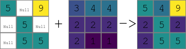
Currently three rasters with preset operators in between them are supported. The rasters are expected to have the following relation:
a + b -> c
r.in.ascii input=- output=input_1 <<EOF
north: 103
south: 100
east: 103
west: 100
rows: 3
cols: 3
5 * 9
* 5 *
* 5 5
EOF
r.in.ascii input=- output=input_2 <<EOF
north: 103
south: 100
east: 103
west: 100
rows: 3
cols: 3
3 4 4
2 2 2
2 1 1
EOF
r.colors map=input_1,input_2 color=viridis
g.region raster=input_1
r.patch input=input_1,input_2 output=result
d.mon wx0 width=400 height=400 output=r_patch.png
d.explanation.plot a=input_1 b=input_2 c=result
Figure: Resulting image
Last changed: $Date$